
Online event promotion
How diagnosing the real problem areas across the end-to-end experience and navigating stakeholder priorities delivered a 7% uplift in VOD engagement and changed how The Economist produces its events.
MY ROLE: Lead UX/UI designer · Owned research, facilitation, all design decisions
OUTCOME: +7% VOD · +4% registrations · +2% live attendance
TIMELINE & CONSTRAINTS: Two sprints, all solutions required Editorial sign-off on placement and timing
TEAM: Events, Marketing, Editorial, Engineering + UX researcher (commissioned), Content design
BUSINESS GOAL: Improve engagement and retention of subscriber events at The Economist
I owned end-to-end UX and UI for this initiative — research direction, workshop facilitation, design exploration, usability testing, and stakeholder communication across Editorial, Marketing, Engineering, and Events. One constraint shaped almost every sequencing decision: all event promotion placements required Editorial review and approval, as they control what content appears on the site and when.
Context
A broad brief with no predetermined direction
The Economist had been investing in subscriber-only live events — exclusive discussions featuring its journalists and expert guests. Following an initial MVP, I was given a deliberately open brief: improve engagement and retention of subscriber events. There was no prescribed direction on where to act or what to fix. It was my responsibility to diagnose the problem areas across the full end-to-end experience and define a plan of action.
My first decision was to run a structured research programme before forming any hypothesis about solutions. The MVP had been built on the assumption that discoverability was the core problem but I wanted to validate that assumption.
Research & Problem definition
HotJar survey
I launched a HotJar survey on the redesigned event pages to baseline sentiment. 63% of users rated the redesign positively. The negative feedback pointed to issues outside the design scope: connectivity problems, login friction causing users to miss event starts, and audio dropouts. I documented these explicitly and escalated them to Engineering and Product, separating them from the design problem I was solving, and keeping the project focused.
Qualitative research
I commissioned the UX research team to run qualitative interviews with subscribers, both active attendees and those who had never attended. I wanted to learn:
How subscribers discover events
What stops them attending
What would change their behaviour
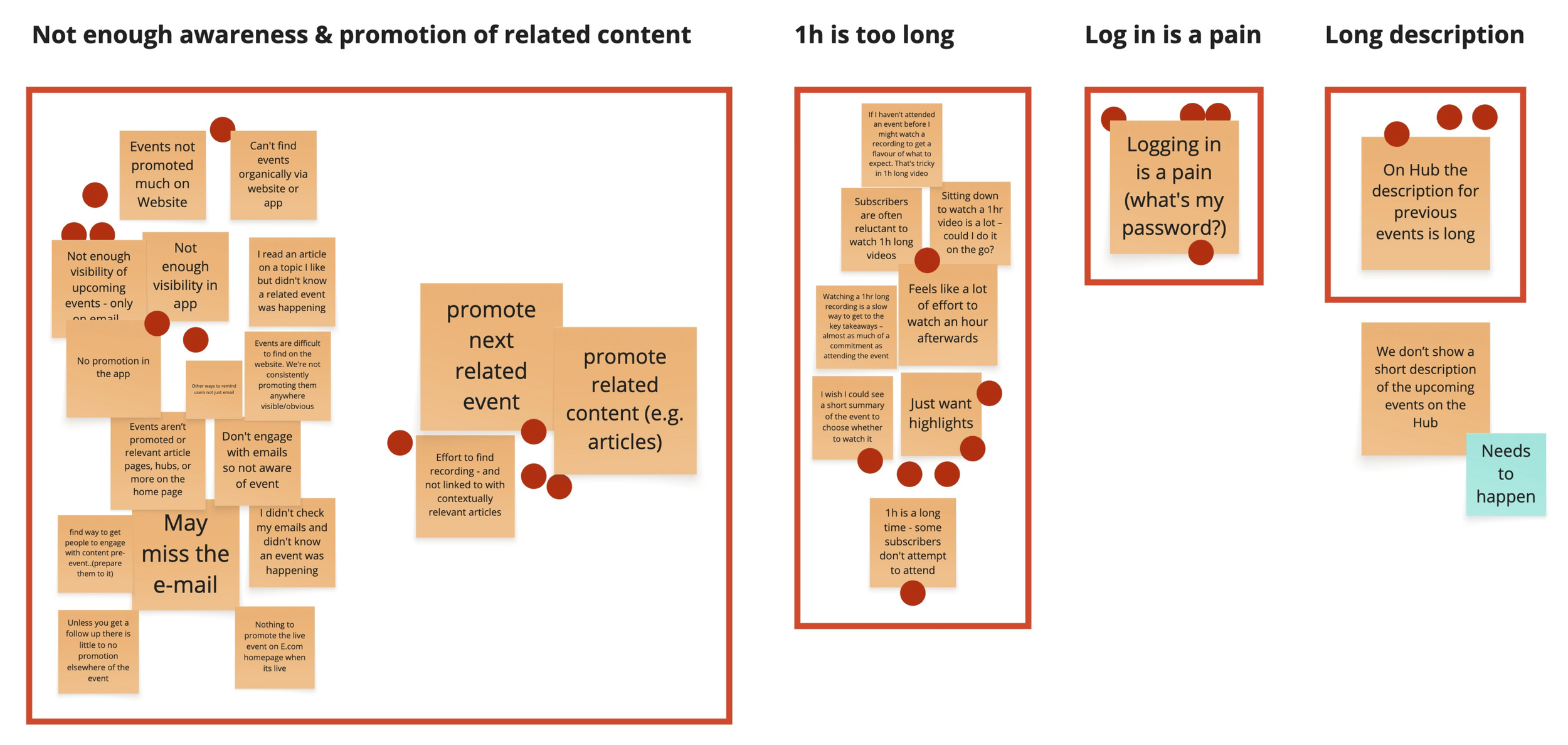
The research surfaced two distinct and equally important problems:
Low discoverability. Events were primarily discovered through promotion newsletters, and users expected them to be surfaced on the website.
Event format. Subscribers consistently described one hour as too long, a commitment they couldn't easily plan around, particularly during the working day. By including non-attendees in the research, we found a barrier.
“Watching a long video requires forethought and planning - I would have to find a good place to watch”
“I can’t find events on the website, I only come across them through newsletters”
Why this changed the scope: Two problems meant two separate workstreams. The format barrier was not something design alone could solve so I brought that finding to the PM and the Events team directly and suggested to explore shorter formats as a parallel track. I didn't want to ship a better promotion system for content that still had a fundamental barrier to consumption. My design work focused on the discoverability problem; the format problem was escalated as a separate strategic question.
Workshops & hypotheses
Based on the research findings, I planned and facilitated two sequential workshops with stakeholders from Events, Marketing, Emails, Engineering, Research, and Content Design. I made a deliberate choice to design these as separate sessions with distinct purposes, combining them would have lost the focus each stage needed.
Workshop 1 — Kick-off
I brought the cross-functional group together to map the known issues for the full subscriber events journey from their respective angles. Each team had visibility of a different slice of the experience, no single team had the full picture.
By sharing the research findings and inviting each team to contribute their known pain points, we created a consolidated view of the problem for the first time. Attendees dot-voted on the most pressing issues, which gave us a shared prioritisation that no single team could contest. The top three issues were clearly owned:
Visibility and promotion to design
Event duration to Events team
Login friction and other technical issues to Engineering and Product.
The hypotheses
Visibility and promotion: We believed that embedding event promotion within high-traffic product surfaces would increase awareness and registration rates among subscribers who never encountered events inside the product.
Event duration: We believed that reducing event length would lower the commitment barrier enough to convert subscribers who were aware of events but not attending.
Login friction: We believed that removing mid-flow login requirements would reduce the number of subscribers missing live event starts due to being redirected away at the moment of joining.
Workshop 2 — Ideation
Having locked the problem priorities, I ran a separate ideation session focused specifically on the visibility challenge. I invited participants to generate ideas without technical constraints as the goal was breadth of thinking before feasibility filtering. The session helped to narrow down three main concepts, which became the foundation for the design exploration phase:
Idea 1: Contextual event promotion on articles and topic pages
Idea 2: A dedicated homepage events section
Idea 3: Event preview clips in the existing vertical video carousel on the homepage
Why two workshops mattered: Running a single combined session would have mixed problem diagnosis with solution generation. Separating the two gave each phase room to breathe: the kick-off created alignment around the problem, and the ideation session channelled that alignment into productive creative thinking. The sequencing also meant that by the time we were generating solutions, everyone in the room had already agreed on what we were solving for.

Design & user testing
Idea 1 - Article & topic page placement
Event cards placed contextually alongside articles and topic pages on matching subjects. User testing indicated that:
This is the main placement where people would expect events to be promoted on the website
There was an equal number of people that preferred each proposed layout (events are shown on the side of the copy VS in the middle of two paragraphs)
It’s clear what those sections are about and that they can register to upcoming events with the “register” button, which was seen as a sensible thing to do

Idea 2 - Homepage section
A dedicated editorial-controlled section surfacing upcoming events, with an email reminder sign-up feature. High-traffic surface, buildable using existing layout patterns. User testing indicated that:
This is the second best placement users would expect events to be surfaced
The “Sign up to email updates” section on the Home page was described as very helpful, although the copy should be tweaked to better convey they’re email reminders
Having a video in the live events teaser it’s preferred because more engaging
Idea 3 - Events on vertical video section
Short event preview clips in the existing short-video carousel on the homepage. Reused an existing component, near-zero additional engineering cost. User testing indicated that:
Users engaging with this section are likely to expect some level of promotion for related content
Adding a button that links to the event page follows a clear and intuitive interaction pattern

The final decisions
After completing the usability testing and synthesising the findings, I pulled together a clear set of recommendations and presented them back to stakeholders and the Editorial team to align on next steps. The feedback session helped us secure buy-in for all the tested positioning of the event components and additional features.
Navigating Editorial's prioritisation
Based on usability testing results, I recommended launching with article and topic page contextual placement first, it had tested as the strongest placement for event discovery. Editorial pushed back. They wanted to begin with the homepage events section and the vertical video carousel, as those surfaces fit better with how they planned and timed content promotion.
I made the case for my recommended sequence but ultimately aligned with Editorial's prioritisation. Their control over content scheduling is a legitimate organisational constraint, not a blocker to work around. The more important outcome was securing buy-in for all three placements. Sequencing was a concession I could afford to make in service of the broader goal.
The sign-up feature, a fight I partially won
For the homepage events section (idea 2), I had designed an area where subscribers could sign up to receive email reminders about upcoming events. Usability testing showed this was one of the most appreciated features.
Stakeholders pushed to remove it, arguing that they didn’t see it as necessary. I pushed back using the usability test data directly: this wasn't a nice-to-have but a feature users found very helpful during user testing. The compromise we reached was to launch the homepage section first as a lighter MVP — a curated list of events without the sign-up feature — with a committed plan to add it in a subsequent sprint. I accepted that trade-off because it kept the feature on the roadmap rather than cut entirely.
Resolving the article layout question
Usability testing returned an even split between two article layouts: event card in the sidebar versus event card embedded between paragraphs. Rather than leaving the decision unresolved, I looked for additional signal. A colleague had independently tested a similar layout pattern for a different project and their results showed a clear user preference for the sidebar. I used that cross-project evidence to make the call.
The results
We A/B tested each feature independently, 50% of users saw the control with no changes, 50% saw the new experience. The homepage events section launched first, followed by the vertical video carousel. The remaining features were temporarily paused due to shifting business priorities. Some results:
~ +4% increase in event registrations
~ +2% increase in live event views
~ +7% increase in VOD views post-event
As expected, the impact was more pronounced on VOD engagement, where users have more flexibility, while live attendance saw smaller but meaningful gains due to scheduling constraints.
One outcome extended well beyond the project itself. The qualitative research finding on event length (that one hour was too long for most people) was escalated to the Events team. It contributed directly to a change the events length, which now is under 30 min.
What I'd do differently
What I'd change: I kept the Hub and event pages as a separate piece of work due to sprint constraints. In hindsight, even a lightweight audit of those pages would have given me a more complete view of the journey.
What I'm most confident about: Commissioning research with non-attendees, not just active users. That single methodological choice surfaced the format problem. Without it, we'd have shipped a better promotion system for content that still had a fundamental barrier to consumption.