
Enhancing event promotion
Context
As part of The Economist’s strategy to diversify storytelling and reach a broader audience, the Editorial team set out to invest more heavily in video content. A key area of focus was our subscriber online events, exclusive live discussions featuring The Economist’s journalists and expert guests.
Following the release of an initial MVP and early design discovery, we recognised the need to take a step back and re-evaluate the end-to-end experience. This case study outlines how we identified pain points in the existing end-to-end experience and conducted a new round of discovery to shape future improvements.
The project: End-to-end experience, UX/UI design, collaboration, stakeholders engagement and usability testing
My role: I led the User Experience and User Interface for Video content across The Economist Web and App
Collaborators: Events team, Marketing, Emails team, Senior leadership, user research, content design
Business goal
Improve engagement and retention of subscriber events at The Economist
Problem
The Economist was investing in subscriber-only live events featuring journalists and expert guests, but these events had low visibility across the product ecosystem. Users primarily discovered events through newsletters rather than within the product experience itself. This created two key issues:
Missed engagement opportunity with high-value content
Underutilised feature, reducing perceived subscription value
Hypothesis
We believed that embedding event promotion directly within high-traffic product surfaces (homepage, articles and topic pages) would:
increase awareness
improve registration rates
drive higher live and on-demand engagement
Outcome
~ +4% increase in event registrations
~ +2% increase in live event views
~ +7% increase in VOD views post-event
The process
Defining the path forward
To build on the initial MVP release of subscriber events, I set out a clear plan of action to better understand how the experience could be improved, with a particular focus on boosting engagement and retention. My aim was to uncover both user pain points and new opportunities for improvement. This involved a combination of research and collaborative activities, including:
Launching a HotJar survey to gather feedback on the redesigned website pages
Partnering with the research team to commission qualitative studies on user perceptions of events
Running a kick-off workshop with stakeholders to map the full subscriber journey and identify gaps
Holding a follow-up ideation session to generate solutions based on the research insights and workshop findings
Step 1 - HotJar survey
The first step was to launch a HotJar survey to our website users engaging with the newly redesigned event pages and find out if anything could be improved. This survey didn’t highlight big problems with the end-to-end experience but flagged some issues during the live event:
63% of users thought that the pages redesign was better, 28% didn’t notice any significant difference, 10% thought it was worse
The people who liked it praised the new UI and were happy that there was a more prominent “Join event” button. Some also mentioned that on event pages they could see the list of panelists.
The main negative feedback were around bad connectivity resulting of the videos being spotty, some people had to log in before watching the event which caused them to miss the start and also the sound cutting off.
Step 2 - Qualitative research
The research team conducted some qualitative interviews with our subscribers to understand how they perceive live events, how they fit into their lives and any opportunities for further engagement. The main findings were:
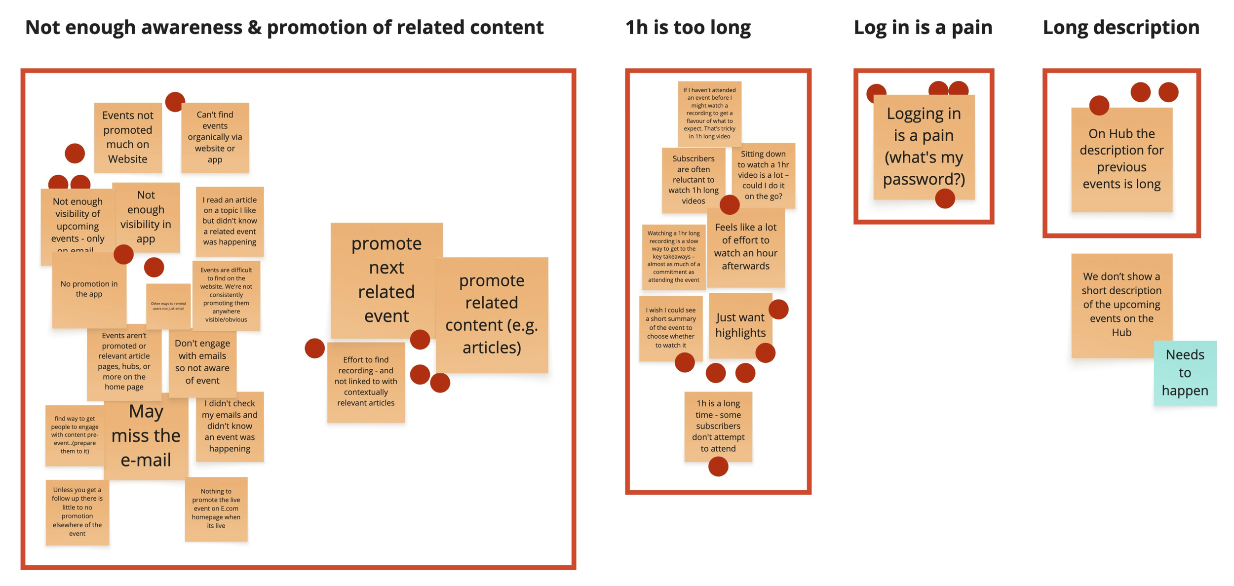
There is low awareness of subscriber events, is not promoted enough. As this content increases visibility across web, app and newsletters, the role in retention could change.
We found that older subscribers were more comfortable with longer videos and typically viewed them on desktop, while younger users preferred watching on their phones. Across all age groups, subscribers expected events to be easily discoverable, surfaced through newsletters, the website, or personalised recommendations.
Events are too long, 1 hour is too much and it’s a major commitment that they can’t afford. As a result, some subscribers don’t attempt to attend. It’s hard to block an hour in their calendar in particular when they’re working.
“Watching a long video requires forethought and planning - I would have to find a good place to watch”
“I can’t find events on the website, I only come across them through newsletters”
Step 3 - Kick-off workshop
Following the research activities, I held a kick-off workshop with key stakeholders from the Events, Marketing, Emails, Research, and Content Design teams. The goal was to adopt a user-first perspective and review the end-to-end subscriber events experience. We shared the research findings and invited participants to bring known pain points from their respective areas, along with any assumptions, UX/UI observations, or technical issues flagged by users.
During the session, attendees reviewed the collected problems and voted on the most pressing ones to prioritise. This cross-functional workshop created valuable alignment across teams and helped shape the next steps for improvement. The top three issues identified were:
Low visibility and promotion of online events across the site — to be addressed through further design discovery
Event duration (typically one hour) being too long — an action for the Events team
Login friction for users not already signed in before joining an event — to be tackled by Product and Engineering
Step 4 - Ideation session
After identifying the key pain points in the kick-off session, we moved into an ideation workshop focused on the most critical issue: the low visibility and promotion of online events across the website. To encourage creative thinking, I invited participants to imagine solutions without any technical constraints. The aim was to generate a range of ideas that could later feed into design exploration. The most popular concepts from the session included:
Introducing a dedicated section on the homepage to showcase online events and link to the Events Hub
Featuring a persistent live event view directly on the homepage
Leveraging the existing “discover rail” component — currently used by Editorial to promote articles, newsletters, and podcasts — to surface upcoming and live events
Promoting events contextually on relevant article and topic pages
These ideas set the foundation for the next stage of design discovery.

Design & user testing
As a starting point, I turned the ideas from the ideation workshop into a series of design concepts. I shared these early designs with my team and stakeholders to gather feedback, which helped me quickly refine the direction and align on what to test.
Idea 1
Events are promoted on articles of topic pages of a similar topic. A component will be built and reused across pages and will showcase either an upcoming, live or past event.

Idea 2
We’ll add a section on the Home page that the Editorial team can move up and down depending on how prominent they want it to be. This section will showcase a few events and an area where subscribers can sign up to get notified whenever an upcoming event is promoted.
Idea 3
Promote events on the “Vertical video carousel” section on Home page, where we currently showcase a selection of short vertical videos of different topics. The idea is for the Events team to create a short preview of the event to promote, add it in the carousel section and have a button on it that links to the event page.

User testing
Once the designs reached a solid state, I took ownership of the research phase — planning, scripting and launching a remote unmoderated usability test on UserTesting.com. The study focused on three key areas: clarity of messaging, sentiment towards the tested ideas and discoverability across pages like the home, article and topic pages.
The main findings were:
Events promotion was well received, in particular on article pages and followed by Home page and Topic pages
It’s clear what those sections are about and that they can register to upcoming events with the “register” button, which was seen as a sensible thing to do
The “Sign up to email updates” section on the Home page was described as very helpful, although the copy should be tweaked to better convey they’re email reminders
Having a video in the live events teaser it’s preferred because more engaging
Teaser event cards would benefit from having a short description to give more context around the event and potentially increase registrations
On articles, there was an equal number of people that preferred each proposed layout (events are shown on the side of the copy VS in the middle of two paragraphs)
“Very helpful. If you wanna join an event , what better place to promote it than right there within the article. Brilliant idea”
“Sign up to reminder emails it’s good because, we have a very busy life. We can forget some events and, having a reminder can help not miss the opportunity”
“I preferred the video version, it immediately caught my attention as I scrolled down the page. The static one didn’t stand out as much, and I could easily have missed the entire section”
Next steps
After completing the usability testing and synthesising the findings, I pulled together a clear set of recommendations and presented them back to stakeholders and the Editorial team to align on next steps. The feedback session helped us secure buy-in for all the tested positioning of the event components and additional features (Email reminders section, video teasers, description on the event component).
The results
As a result, we prioritised launching the events section on the Home page, followed by the event promotion on the vertical video carousel. Some results:
~ +4% increase in event registrations
~ +2% increase in live event views
~ +7% increase in VOD views post-event
As expected, the impact was more pronounced on VOD engagement, where users have more flexibility, while live attendance saw smaller but meaningful gains due to scheduling constraints.